Advice Please….
If I show you three layouts, will you give me an idea of which you like better? Or do you have any different ideas? I have to admit, I am stumped on this one. Thank you!!
Layout #1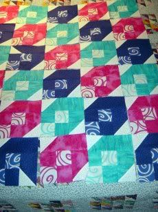
Close up….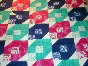
Layout #2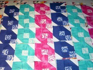
Close up…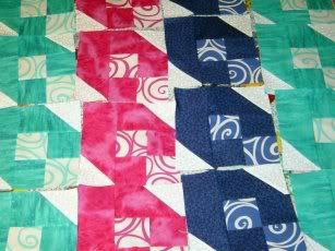
Layout #3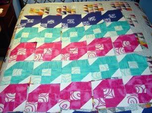
Close up…..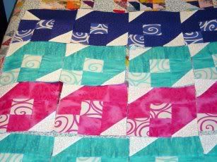
Thank you for any help or ideas you may have!!

I think that the layout for number 1 is very attractive
ReplyDelete#1 please ... TTFN ~Marydon
ReplyDeleteI like the first one best.
ReplyDeleteI think that layout #1 is the most interesting.
ReplyDeleteJane, I don't have an opinion...you have caught me where I don't have much to say. I like them all.
ReplyDeleteJane,
ReplyDeleteI like layout #1, I like the blks set on the diagonal, but that is just me.
Rebecca P
I like #1 the best of the ones you have laid out. Have you tried doing the stripes version, but alternating the side the points are on? That might be cool too.
ReplyDeletei picked variation number 1 before i looked at the comments...and it looks like lots of other people picked it too. i like the way it breaks up the colors.
ReplyDeleteI like #1 also
ReplyDeleteLayout #1 is definitely my favorite.
ReplyDeleteI'd vote for layout #1. Cute quilt!
ReplyDeleteI would go with 1 as well. It has great flow!
ReplyDeleteI have to say number one is my fave.
ReplyDeleteI have to agree with most...I am really liking #1.
ReplyDeleteLooks like I'm among the majority, I too like the first setting!
ReplyDeleteI really like #1
ReplyDeletelayout 1.
ReplyDelete#! for me. I like that it breaks up the color.`
ReplyDeleteI like 1 the best. More of a scrappy feel. Not so planned.
ReplyDeleteI like the scattered feeling of #1.
ReplyDeleteI like the first one the best.
ReplyDeleteis this a trick question. i don't know this pattern but think you should rotate four blocks so that the solid points are on the outside and the white print is on the inside. won't it then look like a flower.
ReplyDeleteI was thinking about rotating too~ flowers or zig-zag's? Lots of ways to play! :-) Have fun!
ReplyDeleteLayout #1 would be my choice. The others are too 'predictable'.
ReplyDeleteI like layout #1. Jenn Love the color combo.
ReplyDeleteNumber 1 is my choice. Seems less predictable and less boring.
ReplyDeleteThe diagonal looks much better.
ReplyDeleteI like #1 Jane - fun colors!
ReplyDeleteCheers!
i think layout #1 is my favorite. :)
ReplyDeleteI vote for #1. It gives your quilt movement and unexpectedness.
ReplyDeleteI liek number 1.
ReplyDeleteI love the pattern!! Number 1 is my favorite :o)
ReplyDeleteMy oh my, it looks like just about everyone chose # 1, but I did like # 3.
ReplyDelete#1 for me....it akes my heart happier than the other ones.
ReplyDeleteI was thinking #1 too, but I was also thinking of moving the blks around like was suggested by Messy Karen and Call me Crazy!!
ReplyDeleteI am not one to really like stripes in a quilt (then why and I thinking of doing a coins one??? lol!) but I do like the colours in this top, nice and cheery - have some fun with it, but go with the one you like. As is, without the blks rotated, #1 is my choice.
Of course I like the all mixed up in #1.
ReplyDelete